This is a Sponsored post written by me on behalf of Moen, Incorporated. All opinions are 100% mine.
So when we bought our house the guest bathroom looked like this:
 That’s right. Someone glued random wooden flamingos to our bathroom wall. In addition, they glued them on with some sort of super human glue that apparently can not be removed without a crowbar. I know this because we finally gave up on them and my sweet father in law literally pried each and every one of those off of the wall with a crowbar.
(Also yes, the former homeowners DID just paint right over that crazy glue drip.)
Basically no matter what I decided to do to the guest bathroom it couldn’t be any worse than what we started with.
Before we brought Scarlette home from the hospital my in-laws removed the palm trees and flamingos and flip flops adorning the walls and painted the the guest bathroom as a gift for us. I hung my favorite Anthropologie curtains floor to ceiling (because I sort of promised Jeff that I would not hang them in the living room in this house on account of how he hates them) and just those few simple changes made a huge difference.
What I really wanted, though, was to tear out the old vanity. For one thing, the bathroom is really small and the vanity was awkwardly sized, jutting out far into the room and taking up a ton of space. For another, the layout of the inside of the vanity meant that even though it was large, there was hardly any usable space behind the doors. And also, it was just unattractive. Made of pressboard and builder’s grade oak it certainly wasn’t winning any awards for it’s craftsmanship.
When Moen offered to send us a new bathroom faucet I said yes for a few reasons. Partially because it was flow efficient and I’m all about making changes that will keep our bills down as we make updates to the house during renovations. But mostly because the old homeowners took all of the little decorative knobs that read “hot” and “cold” off of all the faucets in our house. I do not know why. I just know that it took me forever to figure out which handle was which and also annoys me that every faucet in our house is missing parts. Scarlette likes to stick random objects in the little holes in the faucet that were left behind when they removed them.
Except that because I am an overacheiver with no sense of things like “good time management skills” I decided that it made no sense to put the beautiful new faucet on our old, ugly countertop and that we should replace the entire vanity less than a week before I left to go out of town.
(Also, if you want to hire me I have amazing time management skills.)
I know what you are probably thinking. You’re probably thinking “KA, is your kitchen even finished? Can you not finish one project before you start the next one?” I know this because that is also exactly what my husband said to me but the answer to that is no, I can’t.
(Also, if you want to hire me I am amazing at multi-tasking.)
But Jeff got on board because my father gave him some sort of sledgehammer type thing and he got to rip the old vanity out of the wall. Apparently demolition is appealing to him. Who knew?
I opted to go with the Moravia vanity by Allen + Roth. Here is a tip for you: if you go through Ebates and buy things like bathroom vanities online, you can get cash back AND pick it up at your local store so that you don’t have to pay shipping. That’s the story of how I saved about $20 on this vanity. Holla!
It is much smaller than our old vanity which I thought might open up the room more. And it had a much better use of the space inside, with a drawer plus a shelf. But funnily enough, the actual sink/countertop space isn’t any less than the old cabinet. Mostly because the old cabinet was just built super inefficiently. Also, the new one is real pretty, y’all.
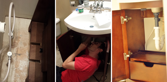 The pipes in our guest bath run straight down into the floor because our basement is also piped for a bathroom. So instead of just pushing the vanity into place, my dad and Jeff sawed two paths into the back of the vanity for the pipes to slide in.
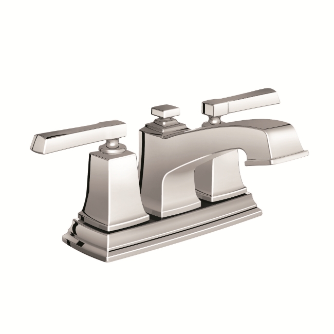
Then they attached the new faucet. The countertop was pre-drilled for a centerset faucet so it fit perfectly. We went with the Moen Boardwalk Centerset bathroom faucet in Chrome because it looked modern but still with classic enough lines to not be too trendy. And because I was all about the energy efficient water flow.
The faucet just popped into the pre-drilled holes and then we attached it to the water line and tightened the connections with a wrench. And by “we” I mean Jeff but only because I was attempting to keep a two-year old from “helping daddy!”
That part only took about twenty minutes and the entire project took about three hours, mostly because someone had glued the side of the original countertop to the wall and it took forever to come off.
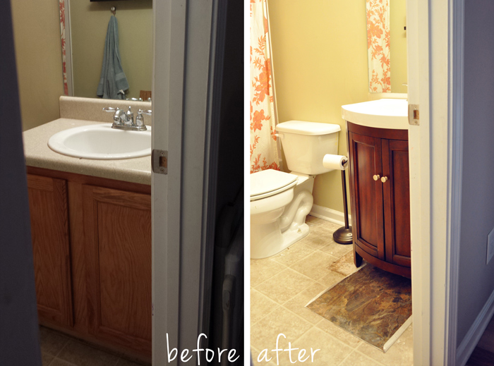
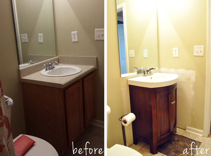 You can sort of see here how much more room we have now. Like, you can walk into the bathroom and close the door without having to stand in the bathtub first.
So still on the to-do list for this space is touching up the extra space where the old vanity was, a new mirror, some new flooring, a new light fixture and getting some art on the walls.
But still, a huge improvement from the tropical paradise in which we started, right?
Now I have to decide what kind of art I want to put on the walls in here. What do y’all like for bathroom art? Obviously flip flops and flamingos are out 😉
The Moen Boardwalk faucet can be bought at Lowes and that is also where I bought the vanity. Isn’t is so pretty?
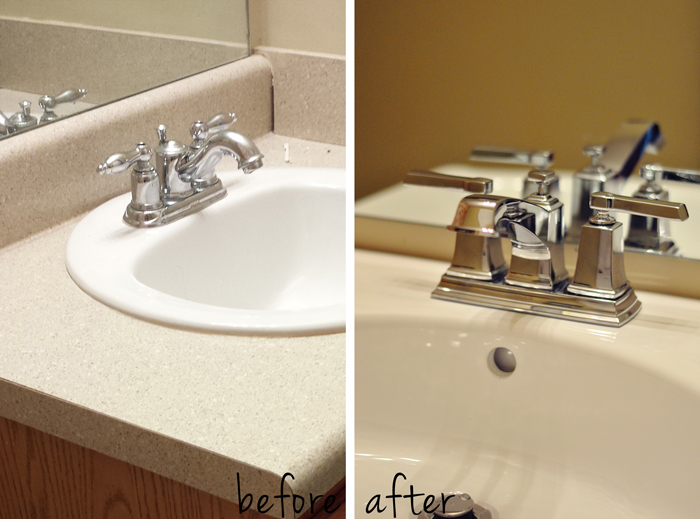
(Thanks Moen, for pitching in on our guest bathroom makeover! We love the look of the new faucet. You can Like Moen on Facebook to see more styles!)
