Hi everyone! Today we’re going to do a little mini-lesson on how to get great photos of your scrapbook layouts. Photographing a scrapbook page can be tricky. And after you’ve spent all that time creating a beautiful project, it’s a bummer to take a photo that doesn’t do it justice, especially if you want to share it online or submit it to a magazine!
Here is the simple formula I use when photographing my scrapbook layouts. It’s quick and easy and can be counted on for pretty good results, even without using a fancy camera! I took these with a point and shoot to show you that while having a big camera is nice, you can get great photographs of your scrapbook page with any camera as long as you do the following:
Step One: Finding Good Light!
This is the most important part. You want to take a photo of your layout in natural light without using your flash. The best thing to do is to find a light source like a window or a door. Then position your layout to the side of the light source, so that the light is hitting your layout softly.
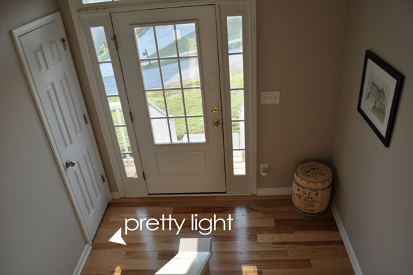
This is the best light source in my house in the morning. It’s our entryway. When you look at the photo, you can see that the light streams in nicely to the left of the door, the right side is too dark for a photo. Our entryway works nicely for photos because it’s well lit and it’s a neutral paint color so there is a blank canvas behind the layout.
Step Two: Setting Up The Layout
What you want to do next is set up your layout so that it is positioned in such a way that the light falls across the front of the page. You want soft, even light, not streaks of light. Another important part of getting a good scrapbook layout photograph is taking the photo face on. While you can lay your page on the floor and take a photo from above, that tends to make the page look flat. By propping up the layout you get a true feel for it, a more three dimensional look.
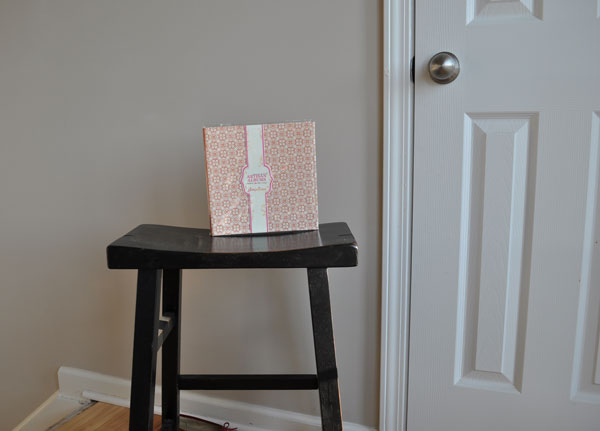
Here is what I do. I take a stool and position it so that it is facing the light at an angle. Then I take an album that’s just slightly smaller than my layout and stand it up on the stool. I’m using one of the Pink Paislee Artisan Albums here because the canvas cover keeps it from sliding around. Position the album on the stool until the light illuminates the album nicely. Once you’ve found the right position, place your layout in front of the album. You don’t have to use an album- I’ve found they work well because their width keeps the layout from sort of folding in on the edges, but you could use a book or a box. I’ve even used plate holders like these seen here on pages that don’t have embellishments on the bottom.
Step Three: Photograph and Crop
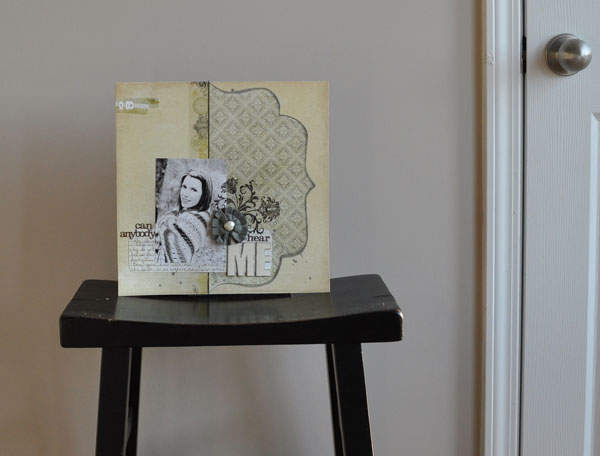
Take a few photos of your layout. Dont use the flash, if the pictures are too dark just move around until you have it in better light. I took a few shots then opened the door to get more light. Then crop it closely in your photo editing program. If you don’t have a photo editing program you can use a free online photo editing site like www.picnik.com
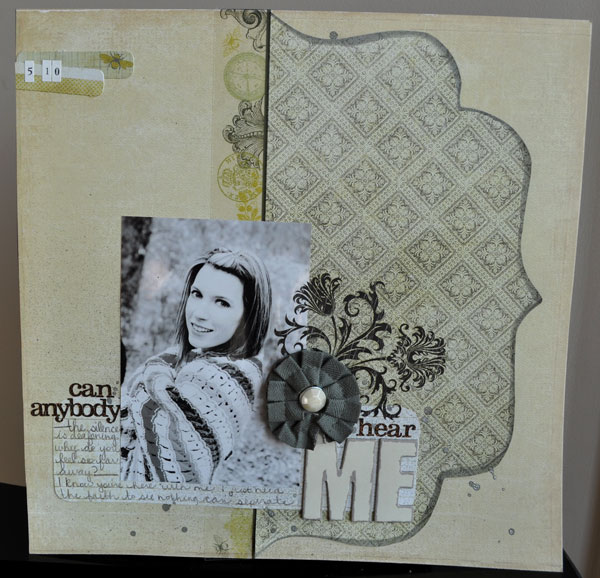
So maybe you want to try to take your photo a little straighter than mine 😉 But you can see how photographing it straight on gives it a lot more dimension. And using the natural light makes the colors true to life.


