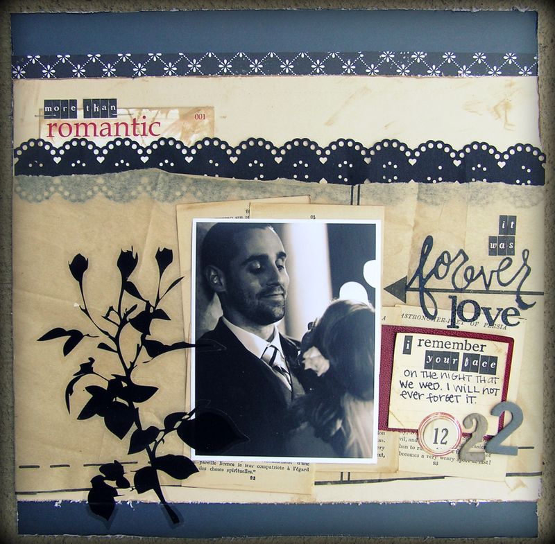
Visually, I think the bottom right corner is too heavy. It's in competition with the branch sticker and it works against the rule of three. If I was submitting it, I'd remove it but Jeff really liked this one so I'm putting it in the album and leaving it as is. Sometimes emotion outweighs design elements.

Let’s Be FRIENDS
I save the best stuff for my FRIENDS in my e-letters, so get yourself a dose of hope + humor delivered directly to your inbox.
Plus, drop your email here and I'll send you the first two chapters of my latest book, absolutely free.

This error message is only visible to WordPress admins
Error: API requests are being delayed for this account. New posts will not be retrieved.
There may be an issue with the Instagram access token that you are using. Your server might also be unable to connect to Instagram at this time.


